Tuesday, April 27, 2010

3.2 Sailing Regatta


We create lots of posters in many of our design classes. For this one, as oppose to the previous blog we were only allowed to use pictures, no text. We were discouraged to use stock photography and were to only rely on our skills in Adobe Illustrator. We had different phrases to work from, this one was the sailing regatta. Creating simple shapes, using filters, and layering techniques I created this simple poster. I learned that it takes a lot of trial and error to master certain techniques to get the affect you want. I had to filter this poster several time in order to get this soft "airy" look. I hoped it would convey the message "Come Sailing." What do you see or feel when you look at this poster?

3.1 Industrial Desgin


For this design I was instructed to create a poster using only text and very specific line art. It was tough because as students we want to use what we like, but we have to remember as designers its about what our client likes. (with limits)All of the line are was industrial and we had to use the specified text to create a well put together, and aesthetically pleasing to the eye design. It took a good bit of time to get this idea going but once it did I found many different things I could do to make it a bit more interesting. First I had to get the placement of my line art where I knew I wanted it, then I placed the text around it. Once I found the font I liked, I layered and tweaked it in Photoshop. This was my 4th attempt at this design. How do you like this design poster?

2.2 Pre-Press


This design was done for Digital Pre-Press. Our instructor wanted use to create a folder that would have and emboss, using a fifth plate. I think the design came out well. I used a multitude of layers and transparencies to create this ghostly, double vision effect. I really liked how it turned out. Are there any other attributes that I could have added to make this more interesting? More color, less color? Could it be too busy? These are some of the things that I have to keep in mind, especially, because I like to over complicate my designs. My instructors often have to remind me less is more.

2.1 Photography


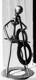
In our photography class we had to do a few different projects. In this one we had to play with light. I found my little brass bass player and put him outside on my railing at about 5pm. I decided to desaturated the picture of color and create a black and white photograph in Photoshop, and played with the exposure to make it more interesting. As I look at it now I wonder if maybe I should have over exposed it a little more interesting. Opinions?

Sunday, April 18, 2010

1.2 Ad Design 2 critique


In this next ad design for Expedia I wanted to give a sense of , tell freedom, tell about the savings, and ease of access to Expedia. Keeping with the transparency theme I added the airplane on the top right along with the hotel at the bottom on the right and the a "sky map." On the left tells about one of the many perks you get when using Expedia. This is another design that I liked but could not figure out that one element that really makes it great. The beautiful open road ,to me suggests, the freedom of travel.

I feel like the rectangle on the left with the text serves its purpose but it looks like it fully belongs. It doesn't feel like the right design element. What do you think?


*Student work not done for Expedia.

1.1 Ad Design critiques


Hi, my name is Amenia Pempleton and I am an aspiring graphic designer. I am here posting some of my work to get an outside perspective and critique. All opinions are greatly appreciated you don't have to be a graphic designer to post!

The first PDF is for my ad design class from last quarter. My company was Expedia. In all three designs I used transparencies to add depth to the ad. I was looking for something so that "said" travel when I found the suitcases. I particularly liked these because they where colorful and attractive (not to mention PRADA) so I used them as the base of the design and then layered my transparencies. Then to break up the design I added the rectangle on the right side with a simple text. I like the overall design but I feel one small thing is missing but I don't know what. What do you guys think?